A New Look For SAWS
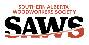
SAWS members will begin to notice there is a new look to communications materials for the organization. It starts with a new logo that has just been launched on the new website.
This is part of a multi-pronged marketing and communications effort under the SAWS 250 Plan approved by the SAWS board to help the organization survive and grow into the future.
Here’s a quick recap of the components of this new effort. It is designed to create a “family look” for all SAWS promotional material. That look, when incorporated into concrete marketing and communications actions, can create a stronger brand for the organization over time. Hopefully that helps drive new membership and new industry profile.
New Logo
The new logo is an evolution of the previous one. Key points are the introduction of color and the addition of a new graphic element which we have affectionately called a “swoosh”. It is a curved line that crosses the word SAWS but it is an element which can also be used on its own in other ways in SAWS communications materials.
For example it can shape photo borders or other elements in the material, such as color blocks. It is a subtle element but like the attention to small design elements that our best members use in their Exhibition entries, it is a small detail that can make a big difference in establishing brand visuals.
As SAWS grows, the organization will be active in many more communities than in the past. This new logo will help establish the brand in those arenas.
New Slogan
Members will see the slogan “Where woodworkers Learn” on many materials. It is part of the SAWS 250 Plan goal to transition SAWS to an educational organization.That can apply to formal training efforts such as workshops but it can also apply to the mentoring that has been such a key part of SAWS since it was established. Watch for new articles around SAWS training on the News Blog on the new website.
New Style Guide
As SAWS grows our logo and other materials will be used by more people inside and outside the organization. It is important there are clear instructions as to how the logo and branding materials are used so that we protect the design integrity and don’t have people heading off with their own version of colours or combination with other design elements.
This new SAWS Style Guide sets out those guidelines for anyone using these design elements.
New Marketing Materials
Watch for a suite of new SAWS communications materials being developed that will feature the new look elements. Key among that will be new materials to encourage membership and industry support.
Files Available
The new brand design files are located in the Members - Admin area of the new SAWS website. It is not expected that they will be used by many people but they are available to those who require them.
Thanks to many SAWS people along the way for input on designing these materials. A special thanks to Katherine Gesell of Katherine Gesell Graphic Design and Photography for her skill and patience in this process.


